One of Africa’s lead Real Estate Solutions Companies, Alpha Mead Group has announced the launch of its renewed brand, symbolized by the introduction of a harmonized brand identity for all the businesses in the group.
“This harmonization, and the launch of the a new corporate identity for our brand are in view of the growth and expansion of our business, the need to help other businesses within our group leverage on the equity of the brand name – Alpha Mead, and to give further expression to our vision to become one of the world’s top Real Estate Solutions Companies”, Engr. Femi Akintunde, Group Managing Director of the company, explained.
He furthered: “this launch is the beginning of a new chapter in the story of Alpha Mead. It signals to the resilience, hard work and passion of everyone who has been part of our story from inception. It is a new chapter in the story of our deep commitment to delivering quality services to our customers, and it is a testimony to the abiding faith of our customers and other stakeholders”.
“So this new brand is for us; more than a marketing tool. It illustrates how far Alpha Mead has come in its 10-year history. We’ve evolved from a small Facilities Management business with five members of staff on January 3, 2007, to one of Africa’s Real Estate Solutions companies with over 600 employees across Africa and the Middle East”.
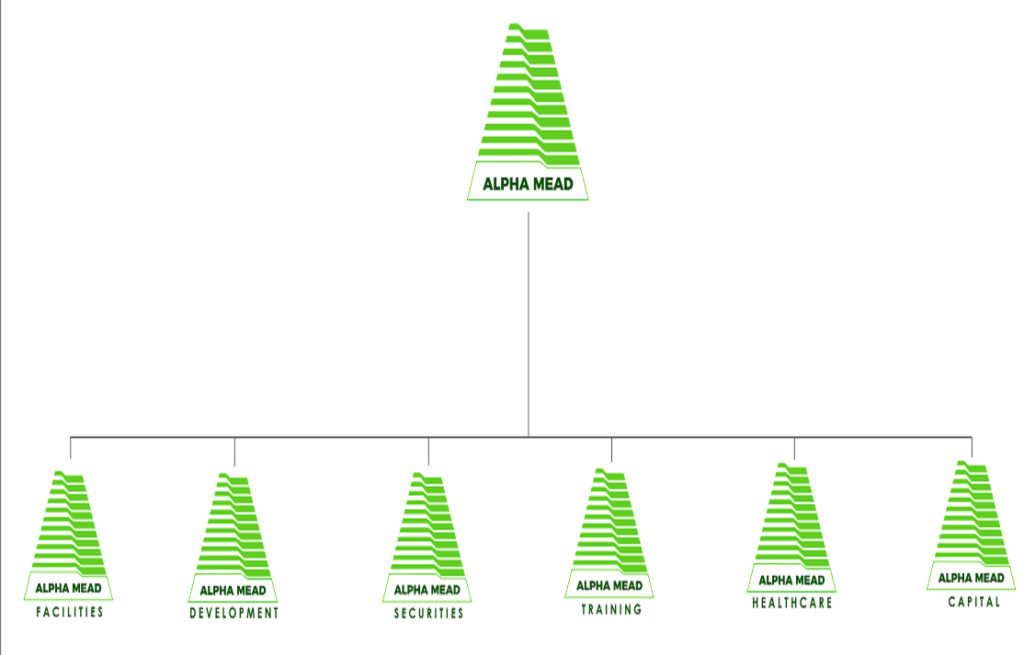
Alpha Mead provides a wide range of services to local and international Real Estate investors/owners with interest in Facilities Management, Real Estate Development and Advisory, Security Systems and Technologies, Training, Healthcare Management Services and Real Estate Investment Services.
According to Femi Akintunde, the new logo maintains the company’s cherished historical pyramid, which signifies structure of a building to give expression to Real Estate which is where the company operates. It also maintains the vent lines, which demonstrate the company’s passion for innovation, modern trends and knack for technology. However, the new logo now has a thick, transparent base which signifies the continuous growth and expansion of the company.
He also explained that the company retained the colours because they both illustrate the company’s commitment to growth, freshness and environmental responsibility.
“These are the key things that we feel should cut across all our businesses, and that is why we have decided to house these ideas in a single identity that is now shared among all our brands. However, we recognize that these brands serve and relate to different stakeholders for different reasons. So they still have their expressions, but are all tied together by the same core values and brand essence, which is all about People, Processes and Places”.
“These and the need to continually assure our customer of service orientation, professionalism, integrity, focus on customer and entrepreneurship are also the reasons for our new tagline ‘…Count on us’. This language demystifies the often complex nature of abstract and unmeasurable concepts behind quality service delivery. So one way we have to demystify this is to handle our customers business like it’s ours”, Akintunde concluded,


About The Author: Alpha Mead
More posts by Alpha Mead